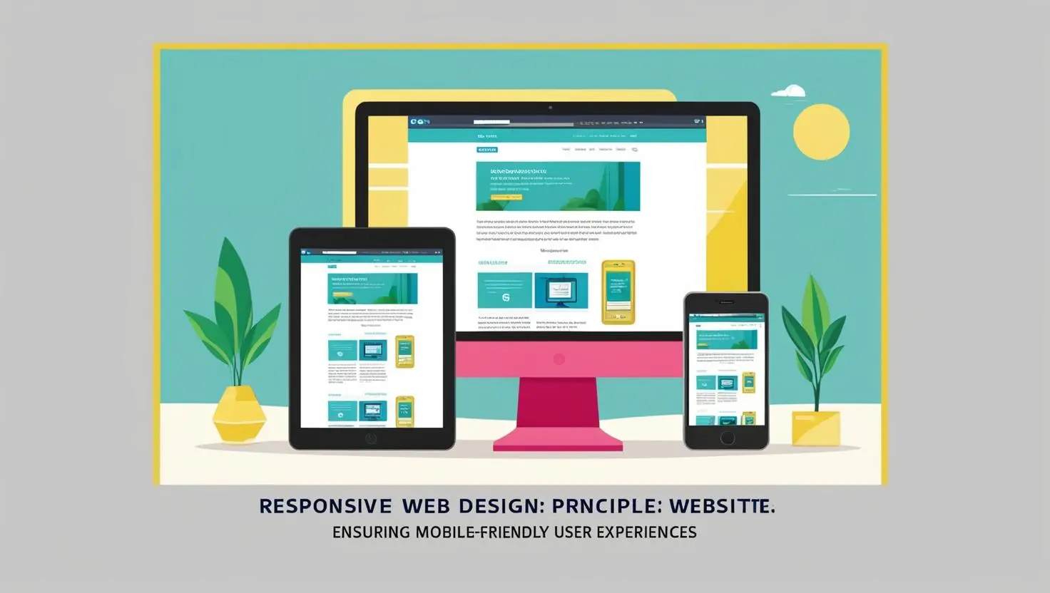
Responsive Web Design: Ensuring Mobile-Friendly User Experiences
 Written by adminFebruary 4, 2025
 The nature of today’s digital landscape makes your website performance all about adaptability-it should be up and working powerfully across a multitude of device platforms. There is, however, one crucial ingredient that can help in this manner. Enter: responsive web design. But what does this really mean, and why should this matter to you? Let me take a dive.
Why Responsive Web Design?
Image driving on a busy highway to work, on a rush-hour, bumper-to-bumper. You want something fast from a favorite website where you can either buy something, or get something. You open it up finally after the wait forever load-it comes up; everything is very tiny and very unreadable you angrily abandon in protest. Now image that’s your customer trying to find your business. Ouch.
That is why responsive web design stopped being optional; it became a need. With more than 50% of traffic coming through mobile globally, no business can just look the other way when it regards looks and interaction with your website on smartphones and tabs. A responsive design automatically toggles the configuration of the site into different screen-size models, where users of each device enjoy uninterruptive and interactive experiences.
How Responsive Web Design Benefits Your Business
Now, on to the meat, of how the direct benefits of responsive web design really make an effect upon your business: other than looking great on a mobile, responsive web design really enhances user experience, heightens SEO rankings, and gives an increase to conversion rates.
It basically comes down to the user experience of businesses using mobile-friendly websites that ensure that users don’t spend much of their time in it but do deeper dives through your content into viewing, rummaging into products or services, and actually converting into possible ways. Fill in the form, subscribe for the newsletter, or buy-it responsively.
But that is not all-search engines like Google reward those websites that can pull off mobile usability. With responsive web design on your website, you will have gained better rankings in SERPs, which further translates to increased organic traffic and visibility. Besides, a mobile-friendly website boosts customer satisfaction, brand trust, and loyalty.
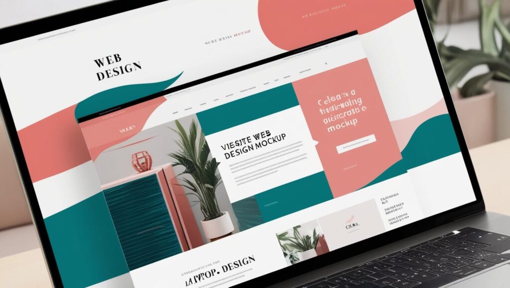
How to Ensure Your Website is Mobile-Friendly?
It sounds so easy when people say that one needs a responsive website, but how would anyone make sure his or her website lives up to such a saying? First, that would be making sure your website layout works on big desktops down to tiny mobile phones.
First, test your current website on multiple devices. Does the image and text resize well? Is the navigation still intuitive if the screen is small? Tools like Google’s Mobile-Friendly Test will give you an instant evaluation on how well your site is set up for mobile.
Whereas, mobile users are always on their toes, hence leaving them with fewer opportunities to be wasted waiting for certain slow-loading pages. Compress images and optimize scripts for fast loading time. The faster your site, the better the UX and your SEO performance.
Now comes the time to remember touch-friendly navigation, fingers are coming in; therefore, buttons should be big enough to tap easily and easily can be filled on smaller screens.
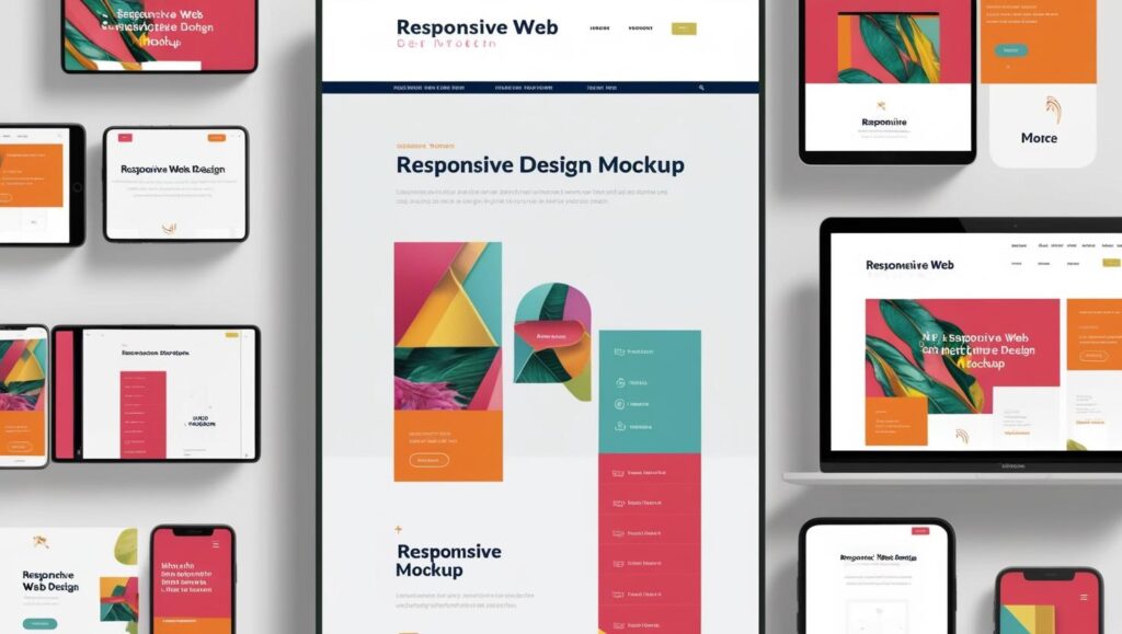
What Are Key Components of Responsive Web Design?
Responsive design isn’t about one layout that adjusts; it’s really all about a combination of strategies and techniques that make the user experience flow on any device. Components of responsive web design include:
Fluid Grid Layout: It is a non-traditional fixed-width design where, using relative units other than fixed measurements in pixels, for example, it scales up and down content smoothly to fit various screen sizes.
Responsive Images: On responsive sites, images need to resize according to devices and resolutions. Max-width: 100% is that magical word in CSS that can make the size of an image shrink and grow with screen dimensions without distorting it at all.
Media Queries: Probably, the strongest point which responsive design offers is media queries. Media Queries allow the web designer to use different styles according to screen size or device type. You could indicate whether font size should be large on desktop devices and small on mobile phones for better readability.
Added to all the above-mentioned, this, in fact, makes the approach of mobile-first quite significant, considering the penetration of mobile phones, thereby considering designing for small screens in a way that basic elements, that a website really needs in order to convert, are first planned on mobile phones before their larger screen counterparts.
Why Invest in Responsive Web Design Today?
The competition in the digital landscape has grown so colossal. Non-responsive sites are sure to be at a disadvantage since visitors might get lost, search engine rankings go down, thus harming one’s brand reputation in the process. With this thought, responsive web design is not just a technical upgrade but also one for business that keeps one steps ahead.
Think about this: For most of your clients, for instance, your website is the first touch with your brand. If their experience is seamless and intuitive, they are going to be way more likely to return and make a purchase, referring others to the site. In today’s mobile-first world, having a responsive website is not a nicety-it’s a necessity.
Conclusion
Daunting as it sounds, responsive web design is actually quite simple to get started with-at the very least, it is for the seasoned developers and designers among us. Whether starting afresh or redesigning your currently existing website, using responsive web design now will go on to pay dividends long into the future. Adopt a responsive design framework that works for you. If it means hiring a web developer who can get the job done for a new or an existing website, outsource at least the job with a professional to guarantee that your old design works gracefully on mobile phones and devices.
Your website should be a virtual storefront for your online business; let its design be future-proof and supportive, offering a responsive experience to every visitor.